|
For this portion, I was asked to create three different variations of each of the three logos I chose. The most challenging part of this process was choosing the color scheme because I had to choose colors that matched or had the same feeling as the word describing the logo. My most favorite thing about this process was vectorizing the three logos onto a gravit document. From this experience, I learned how to get very creative with the things I make. I also learned how to create different different kinds of logo based on the word I chose that the logo represented.  I decided to create a logo for myself because I wanted to be creative and make something that represents me. My logo was created off the word dreamy. This logo represents this word because the details put into the letters are kind of like something that you would see inside your dream. This logo was my favorite of the 9 because I thought that the dreamy word really fit the 3 variations. I chose this exact one because I liked the color scheme of this logo better than the other two. I think that the colors blue, light blue, yellow, purple, and green all fit into the word dreamy best. 
0 Comments
The logos I made are for my initials. E is the initial of my first name and P is the initial of my last name. The three logos that I chose is Dreamy, Jagged, and admirable because they are unique. The dreamy logo represents some sort of world that is in someone's dreams, the Jagged logo represents the E and P having rough sides, and the admirable logo represents a drawing that is admirable. The one that I like the best is the dreamy logo because it looks the best. The one I didn't like was the simple logo because it is too simple and there isn't anything unique. The process of making the logos was fun because I was able to think of many creative ideas. It wasn't frustrating and it was enjoyable. The most difficult logo to draw was the angry logo. In the Color Names project I was assigned to create a piece of work that displays at least 15 different colors, and label all of the colors with their RGB Value and Hex Code. My artwork is just 15 hexagons with 15 different colors. I made this by making 15 hexagons and filling them with different colors and writing down their RGB Values and Hex Codes. One of the challenges I faced was finding the RGB Values and Hex Codes, and I was able to overcome this by watching the tech video of how to find the RGB Values and Hex Codes. Some of the successes I achieved was finding the RGB Values and Hex Codes, filling the hexagons with colors, and etc, and there was no concept or inspiration behind my artwork. In the Color Schemes project I was assigned to create a monochromatic, analogous, complementary, and triadic color palettes using the website Adobe Color, and each color palette needed 5 colors. Also, I was supposed to label each color palette by its "scheme" and label each color by its hexadecimal code. You are able to use Adobe Color by clicking on a color palette and dragging the circles to choose which color you want. One of the challenges I faced was writing down all the RGB Values and Hex Codes. I was able to overcome this with hard work and effort. One of the successes I achieved was creating how to put the colors in a shape, and there was no concept or inspiration behind my artwork. Color Names Color Schemes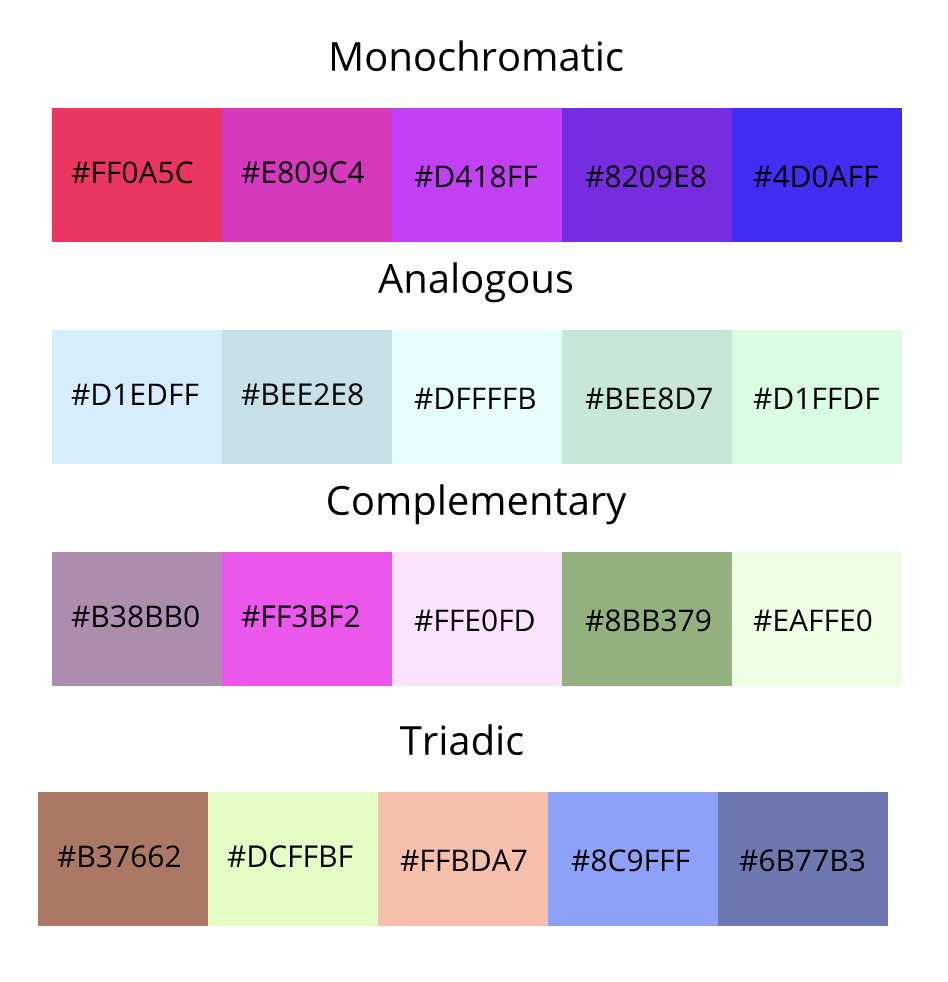 Typeface ComparisonTypography is the visual component of the written word. Typography is important because when you use typography, you can emphasize a word, and tell the readers a hidden meaning. The quote "Each font has a personality and a purpose" means that each and every font is different and is unique in its own way, and has a meaning. There are 5 different types of fonts, Serif, Sans Serif, Monospaced, Handwritten, and Novelty. Serif font have "feet," is used in large blocks of texts, and used in print. Sans Serif fonts do not have "feet," is good for headlines, titles, and smaller chunks of text, and used one the web. Monospaced fonts do not work well for large blocks of text, used in coding, and each letter takes up the same amount of space. Handwritten fonts are cursive, calligraphic, or handwritten, sometimes is difficult to read, and it is good for logos, large headlines, and details. Novelty fonts gains attention, used sparingly, and it's popularity comes and goes. From these two projects, I have learned that typography is always used in everyday life, is used for many. different purposes, and etc. Typeface ComparisonIn the Typeface Comparison activity I was assigned to create an example text for each font, give the font's name, and Label the type of font. I had to use 5 different fonts Serif, Sans Serif, Monospaced, Handwritten, and Novelty. I did what the assignment told me to do step-by-step.  Word PortraitsIn the Word Portraits assignment, I was assigned to use 10 fonts and 20 words. I had to use 2 words per font and I had to use a word that directly contradicts to the look and feel of each and a word that is not good for that font. For this assignment, I followed the step one-by-one and applied what I learned about the C.R.A.P design principles and completed the assignment.  For the first picture I was assigned to trace the lines of the superhero related things, and I did that. On the second picture I had to carve out the face of Abraham Lincoln on the penny, and I did that. On the third picture I was assigned to use the pen tool in order to make a drawing of my own, and I did that. The pen tool is a tool that helps you draw shapes with curves, trace objects, and clip it. My final illustration is a picture where people stand around the earth representing the people all around the earth. Some challenges I faced was tracing the person with the pen tool in my final illustration, and I was able to overcome this with hard work. Person Earth    I drew a penguin in snow because I like penguins and the Arctic. From this activity I have learned that coding is not as simple as one may think, and that people need to take a lot of time to make one simple project even though it looks very simple. I have also learned how to draw simple shapes, fill shapes with color, and make a background. For example, ellipse(?, ?, ?, ?) makes . a circle. However, drawing a triangle was a difficult challenge because the code was triangle(?, ?, ?, ?, ?, ?), while other ones were ?(?, ?, ?, ?). 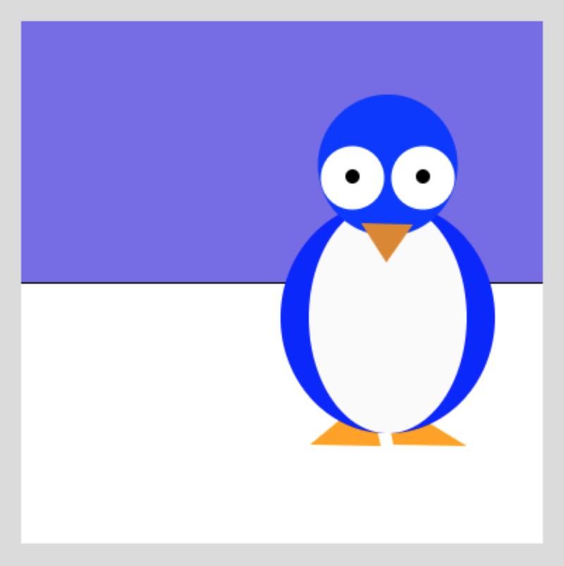 This is the picture that I have been working on for the last couple of weeks. It is the logo of a esports overwatch league team. I think that this scene depicts something that is meaningful for me because I have always liked this team and watched their games. Also, this logo's main color is orange, and I like this logo because of its bright color scheme. 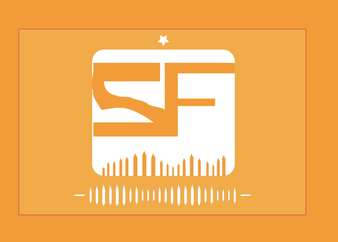 I learned how to change the shapes corner and points and create compound shapes. I learned how to change the layers of a shape, group different shapes together, and align shapes. I learned how to fill in shapes and make borders. I also learned how to change the shape's opacity. |
|
 RSS Feed

